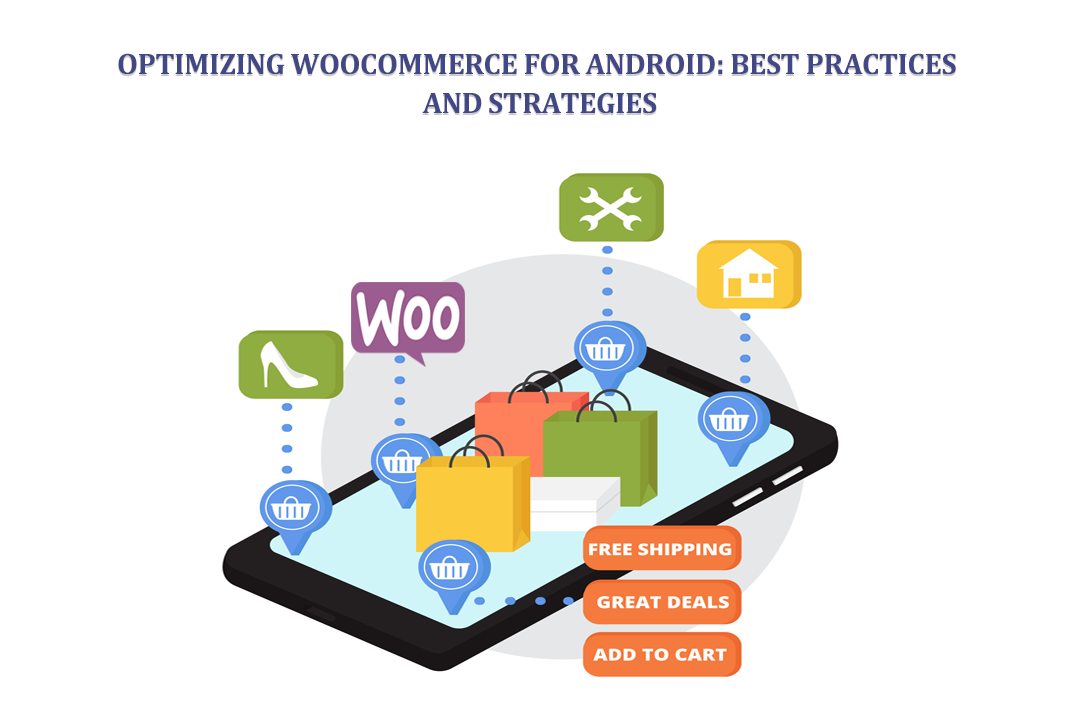
The landscape of commerce is undergoing a dramatic shift. Consumers are increasingly turning to their smartphones and tablets to browse products and make purchases. This trend is undeniable, with mobile commerce (m-commerce) surging at an astonishing rate. Android devices are in the hands of most online shoppers, boasting a dominant market share.
To thrive in this mobile-first era, online stores built with WooCommerce must cater specifically to the Android user experience. This article serves as your comprehensive guide, outlining the essential best practices and strategic approaches to ensure your WooCommerce store delivers a seamless and delightful experience for Android users.
Building for All Screens
This is a core principle of mobile optimization:
Responsive Design Defined
Imagine a website that magically adjusts its layout and elements to perfectly fit any screen size, from a desktop monitor to a tiny smartphone screen. That’s called responsive design, which ensures your WooCommerce store displays beautifully and functions flawlessly on any device a customer might use.
Catering to Mobile Users
Think about the limitations of a mobile screen. Responsive design addresses these limitations by:
- Scaling elements: Images, text, and buttons automatically resize to fit the available space.
- Optimizing layouts: Multi-column layouts on desktops transform into single-column views for easier navigation on mobile.
- Prioritizing content: Responsive design ensures crucial information like product details and purchase buttons are readily accessible.
Mobile-First Mentality
Let’s look at another principle of mobile optimization:
Theme Selection Matters
Not every theme is equal. Choosing a mobile-friendly theme specifically designed for responsive design is crucial. These themes offer features like large, easy-to-read menus with ample spacing, allowing for effortless one-handed navigation. Also, mobile-friendly themes ensure buttons are large enough for comfortable tapping.
Besides that, a mobile-optimized theme has product information and images presented in a way that’s easily digestible on a smaller screen.
Image Optimization
This is another essential part of mobile optimization:
Images and Loading Speed
Large, unoptimized images can significantly slow down your website, especially on mobile connections. A slow website translates to frustrated customers and lost sales.
Striking the Right Balance
Image compression tools can significantly reduce file size without sacrificing visual quality. Popular formats like JPEG and the newer WEBP offer good compression ratios while maintaining acceptable image quality.
Next, we’ll focus on optimizing your WooCommerce store’s performance for Android.
Website Speed
These days, website speed reigns supreme. Even a few seconds of delay can increase bounce rates and decrease conversions.
Since a significant portion of your customers will be browsing on Android devices, optimizing website speed specifically for them is essential. Here are key strategies to achieve this:
Investing in Quality Hosting
Your website’s foundation is its hosting provider. Choose a provider with a robust infrastructure specifically designed to handle mobile traffic efficiently. Look for features like Content Delivery Networks (CDNs) that distribute your website’s content across geographically dispersed servers, ensuring faster loading times for users regardless of location.
The Power of Caching
Your website stores frequently accessed data like images and pages in a temporary storage space, and this process is called caching. By utilizing caching plugins, you can significantly reduce the load on your server and deliver content faster to users, especially those on mobile connections with potentially slower bandwidth.
Minification Magic
Website code often contains unnecessary characters, spaces, and comments that bloat file sizes. Minification removes these elements, resulting in smaller HTML, CSS, and JavaScript files that load significantly faster, particularly on resource-constrained mobile devices.
Payment Gateways
This is a necessary strategy for optimizing your WooCommerce store for Android devices.
Frictionless Transactions
For any online store, a smooth and secure checkout process is paramount. This is especially true for mobile users where even minor inconveniences can lead to cart abandonment.
Prioritizing Security and Trust
Partnering with reliable and secure payment gateways that are optimized for mobile devices is crucial. These gateways should adhere to industry-standard security protocols and offer features like:
- Tokenization: Sensitive payment information like credit card details are not stored directly on your website, minimizing the risk of data breaches.
- Fraud Prevention: Advanced fraud detection systems help safeguard against unauthorized transactions.
Which Payment Gateway to Choose?
Several payment gateways cater specifically to mobile users, offering features like in-app payments and mobile wallets. Researching to find the gateway that best suits your target audience and geographical location is crucial.
Some mobile-friendly options are Google Pay, Stripe and Paypal for your WooCommerce store.
Enhancing User Experience
While technical aspects are crucial, a truly exceptional user experience transcends website speed and functionality. Here’s how to optimize your WooCommerce store for a delightful journey on Android devices:
Simplified Navigation
Trying to navigate a complex menu on a tiny phone screen will lead to nothing but frustration. Advocate for clear and concise navigation menus with larger font sizes, ample spacing between elements, and a logical hierarchy, ensuring users can quickly find what they’re looking for.
The Power of Search
In today’s fast-paced world, users want to find what they need instantly. A robust search bar is essential, offering relevant suggestions and having autocomplete functionality.
Product Pages Optimized for Mobile
High-quality product images are the cornerstone of any online store. However, for mobile users, image optimization takes on even greater significance. So, you must prioritize mobile-friendly image formats, fast loading times, and zoom functionality.
Compelling Product Descriptions
Clear and concise product descriptions are essential for mobile users with limited screen space. Thus, you must focus on vital information and keep it brief and scannable. This makes reading on mobile devices easier.
Additionally, consider incorporating WooCommerce Product Badges to highlight special offers, new arrivals, or discounted items. These badges can grab user attention and influence purchasing decisions.
Additional Strategies for Android Optimization
Next, let’s focus on some additional strategies to enhance the Android user experience further:
The Power of Mobile Apps
Developing a dedicated Android app can provide a more immersive and engaging shopping experience. You’ll get plenty of benefits from your app, including push notifications, loyalty programs, and personalized user recommendations.
Offline Browsing
Imagine a user on a commute with limited internet connectivity. Enabling offline browsing allows users to browse product categories and descriptions and add items to their cart. Once they regain internet access, the cart contents and checkout process can be completed seamlessly.
AMP (Accelerated Mobile Pages)
AMP, developed by Google, is a framework designed to create lightning-fast loading mobile web pages. It has various advantages, including improved SEO and enhanced user engagement.
Continuous Improvement
The digital landscape is constantly evolving. Monitor critical metrics like website traffic, conversion rates, and user behavior to identify areas for improvement. Utilize analytics tools to gain insights into how Android users interact with your store and adapt your strategies accordingly.
Conclusion
In conclusion, optimizing your WooCommerce store for Android devices is no longer optional – it’s essential for thriving in the mobile-first era. Adhering to the best practices and strategies outlined in this article can create a seamless and delightful shopping experience for your Android users.
Remember, providing a fast-loading website, clear navigation, secure checkout options, and informative product pages are fundamental building blocks. Additionally, consider venturing into mobile apps and offline functionality to enhance user engagement further.
By prioritizing the Android user experience, you can unlock a world of potential customers and ensure your WooCommerce store remains a frontrunner in the ever-evolving landscape of mobile commerce.
Author Name: Inam Ullah Dar

Inam Ullah Dar is a content writer by passion and profession. He started his journey with Motif Creatives. He primarily writes for guest post articles falling under various niches. The main area of his interest and expertise is Web design & Digital marketing. He enjoys reading and writing about healthcare, mindfulness, and well-being to educate people about being happier and lively. His work has been published on many high-authority websites. He believes that writing is an effective way to communicate at better levels.

